Taco Bell DaaS
-
Intro
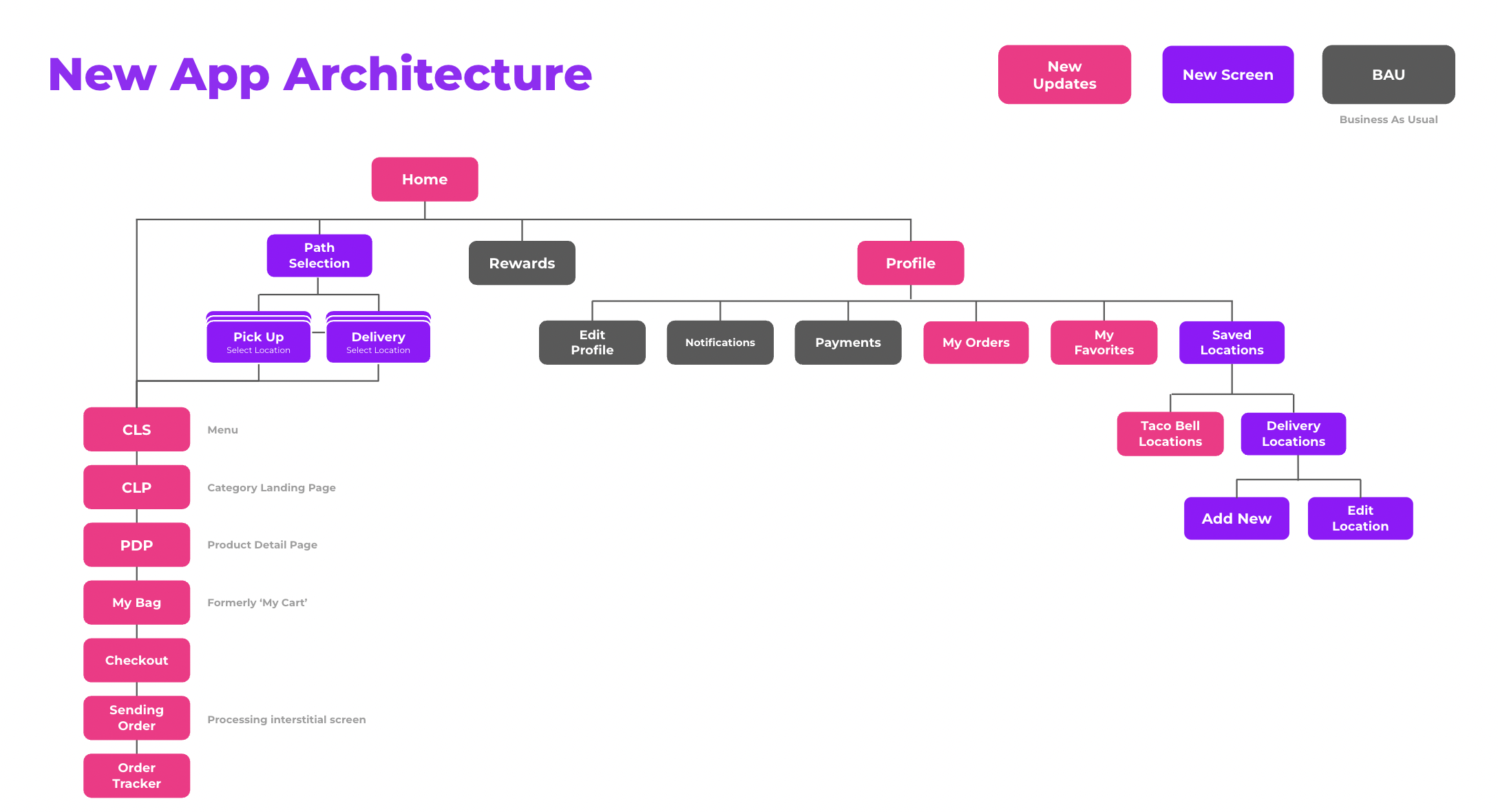
At Deutsch LA I worked with Taco Bell on a number of projects including a large scale effort to introduce delivery as a service into the app and create a cohesive design system that would span across web and app.
-
Process
The process started with creating a customer journey map and a competitive audit. We then looked at Doordash and its capabilities/limitation while exploring different design directions. After designing a couple of different explorations we conducted surveys/internal user testing and created a prototype based on feedback. Using the prototype, we conducted formal user testing with 10 participants and incorporated user feedback into our designs before reviewing with the development team.
Since DaaS has launched, we’ve been iterating on certain parts of the experience as well as designing for new experiences.

-
-
Checkout Iterations
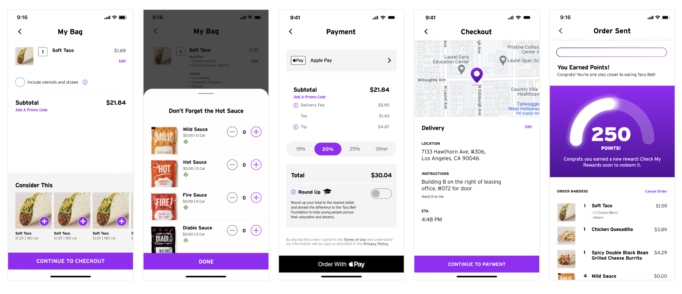
One part of the experience that we’ve iterated on since launch has been the checkout flow—we went through seven iterations before arriving at our final design. The largest pieces of feedback that we considered regarding our old design going into this design were information overload, the need for a map, and the ‘switch to pickup’ positioning.

-
As shown above, our initial design included all steps of checkout in a single scrollable page. After conducting competitive audits and some user research, we eventually decided on a step-by-step checkout process that alleviated information overload while allowing users to clearly visualize each step.

-
Designs

-
-
Results
Since launching DaaS we’ve seen a 189% increase in total transactions, a 39% increase in delivery transactions, a 7.2% increase in engagement, and a 110% increase in Round Up donations.